Wednesday, March 16, 2011
A look at things to come
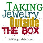
I have been takiing a lot of photos lately, as well as writing a lot of blogs, I am not going to link all the posts to the topics like I should, but: I have written about needing a new look, branding, professionalism, my new website, and the like. So as a part of all that I think I have my new banner figured out.. what do you think?


Subscribe to:
Post Comments (Atom)


I like it! I think that having a cohesive brand image is important. Banners are a must on a blog!
ReplyDeleteLove the banner! Glad you went with that logo.
ReplyDeletefor having a blog that is witty, humorous, and informational with such great photos that makes me eager to see the next post....
ReplyDeleteI'm handing over the "Stylish Blogger" award
more info here:
http://jennizart.blogspot.com/
:)
I like it too! I love the black and white.
ReplyDeleteI think it's super cute, but you already know I don't like the font! (Hey, I figure since you're so honest, you can take it)
ReplyDeleteBtw, re: the font - one of the reasons I feel very strongly against it is because it is very recognizable as one of the default fonts that come installed on your computer, and is so overused. To a graphic designer that is a big mistake. I strongly suggest spending a few bucks to get a font of your own - I love myfonts.com. you can even test your text in those fonts. It would make a huge difference.
ReplyDeleteThe font isnt set in stone, but I do agree and got that feedback a lot about getting something completely original, although this isnt a default font, it is free and readily available. luckily that is a quick change if needed. good thing I saved the project file.
ReplyDeleteyour forgot to add that Your LOVELY wife came up with this banner idea.
ReplyDelete