
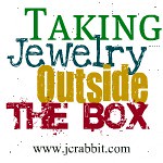
I want the lettering in my logo and banner to be distresses like my work is. I have several options but have yet to decide. That is where you come in. Take a look at the following 5, and let me know which you like the best. If you feel that the one you like the best is not the one that best suites my business, then let me know that as well.


I am looking forward to seeing what you think.


I'm partial to the 3rd one. I think you can read it the best. My $.02 :)
ReplyDeleteMy favorite is the 4th one. Good luck choosing.
ReplyDeletePersonally I like them ALL. To me any logo that is different catches my eye and I don't forget it.
ReplyDeleteI really like the 4th one. I'm not sure if it suits your business, though.
ReplyDeleteI think the fourth gives you a different font, looks a bit vintage and has readability. I like the script in the first one but it is hard to decipher.
ReplyDeleteI LOVE all of them, but I think the best is the last one. It is easy to read and still has a lot of personality.
ReplyDeleteMy thoughts...
ReplyDelete1. is it from a straight font or did you do something to the font after you chose it? I like original logos that can't be duplicated just by finding the font they used.
2. I agree that #1 is hard to read.
3. I think with your talent and skill you should be able to hand make a logo using a stamp you carved. That would be totally original and rustic and un-duplicatable. :) Call me if you want more ideas or explanation on my comments.
4. As it stands I like #2 & #4 the best.
I think the first one is difficult to read. My choices would be #4 or #5. But I don't see any products in your shop right now so I don't know if it suits your shop or not sorry.
ReplyDeleteI checked your sold items to see what sort of work you do, and those frames are just beautiful. When will you be listing again? :) I think the 5th logo is the best fit for your shop. It makes me think of the kind of space that I picture those frames in. Romantic and wistful, and the distressing adds a touch of rustic vintage. I also like the 4th one, but it's too emo/goth/bold for the feel I get from your shop.
ReplyDeleteI will be listing items again before the end of march.
ReplyDeleteHmm...at first I was really drawn to the first one, but I think it may be kinda hard to read the first two letters.
ReplyDeleteSo - my favorite is the second. I think it's a really unique font!
I like the 4th one. It has an old style font and the distressed look that you said you were going for while still being legible.
ReplyDeleteI like them all too! But Bleeding Cowboy is one of my favorite fonts :)
ReplyDeleteThird one!
ReplyDeleteDid you end up picking a logo? It doesn't look like it from your etsy site.
ReplyDeleteI don't like the 3rd one - I think that font is just too clean and modern looking to be distressed looking, and I also just think it's too round and huge. It is my least favorite so please don't pick it.
I like the 2nd one the best. It looks masculine and scruffy, it makes me think of a guy building stuff in a shop, getting his hands dirty.
The 1st one reminds me too much of coca cola because of the C, and I doubt you want to remind people of coca cola. The other two just don't seem like they have the feel you want.
So, in conclusion, I strongly feel that you should pick the 2nd one.
Actually, after reading February Jones' comment, I do think the last one isn't horrible. So I wouldn't mind if you picked that one either. :)
ReplyDelete